Lets turn to the dark side for a moment.. Ready?
Assume you are flying a Falcon jet over the Atlantic Ocean by night. Sitting comfortable in the serenity of your quiet cockpit, you stare at the stars. Until suddenly you see in the corner of your eye an exceptionally close star. You look up and realise, it’s not a star but a light showed up on your overhead panel. It says “ST BY” underneath the right fuel pump toggle switch, meaning the stand-by fuel pump is running instead of the main fuel pump.
Why this light caught your attention is because in the normal ‘state’, while the main fuel pump is running, there should be no light. This is an example of dark cockpit philosophy which Dassault has implemented successfully in her Easy cockpit avionics.
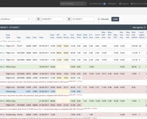
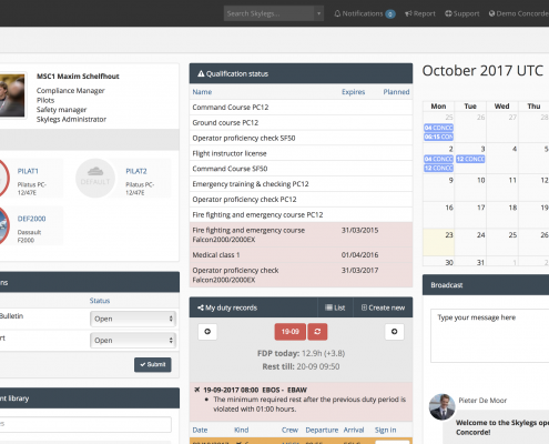
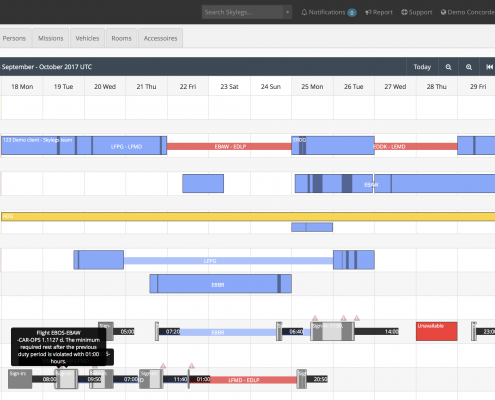
At Skylegs we adhere to the same philosophy when developing a user interface. We see no point in drawing attention to something which is in a normal ‘state’ so hence, we do not colour code. Nor we even show it for that matter, if it does not add value to the experience you are trying to achieve.
Interested in what else we borrowed from the cockpit and added to our software? Stay tuned by subscribing to our newsletter or follow us via social media!


